Critique it!
Each day I will post my design work for the day. YOUR JOB: Critique it! The object of this blog is for me to improve my body of work via feedback that I get from your critiques. Therefore, I request that you only leave feedback that has constructive criticism in it. Leaving posts that say "great job" and the like, serves no purpose other than to boost my ego.


1 Comments:
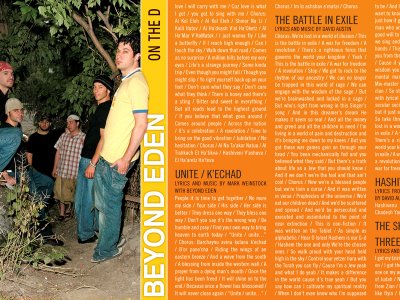
I lOVE (can I say that?) the middle one. How the guy is cut into teh bold stark yellow stripe. It's lends so much tension, yet it's a calm tension (am I making sense? I ddin't really rendezvous with my pillow last night). The orange works well with the blue stripe on the guy's wringer too! kudos.
What font is the big lettering in? It's nice..
Did you take the photos? The lighting is superb. In the first one there's just the right amount to make it 'edgy' but still not icky-dirty-grunge.
The third is ok..not as strong as your first two..maybe add another [transparent] layer to give it more depth? The tape is a nice element. Did you draw it or shoot it? (or stock-photo it?)
:tumbsup:
Post a Comment
<< Home