Arki-tech website revision
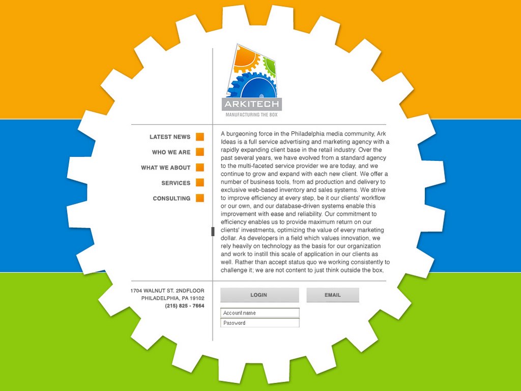
This is a revised idea of the concept I did last week. In this concept the big white gear rotates when the user goes to a new section
posted by de'artist @ 4:08 PM
2 comments
![]()
![]()
Each day I will post my design work for the day. YOUR JOB: Critique it! The object of this blog is for me to improve my body of work via feedback that I get from your critiques. Therefore, I request that you only leave feedback that has constructive criticism in it. Leaving posts that say "great job" and the like, serves no purpose other than to boost my ego.
posted by de'artist @ 4:08 PM
2 comments
![]()
![]()


I am working as an art director for a small Ad/Marketing agency. Only problem is that I am the only artist currently on staff. Therefore, I dont have co-workers to feed off of. My hopes are that this site can act as a substitute for that, and improve my design skills.
2 Comments:
I like the colors and all but the background looks like a flag. Not like the business card where it looked kind of "modern".
cz
The card had bold lines from what I remember..maybe incorporate those somehow? It's clean, but a bit too clean IMHO. Maybe move the gear slightly to the left and add some [small?] element to the right side? -or- Make the gear bigger and move it ALL the way left (so we only see 3/4 of it sticking out). That'll add more visual interest and tension to the piece.
Post a Comment
<< Home