Ahavas Yisrael website concept
posted by de'artist @ 11:49 PM
5 comments
![]()
![]()
Each day I will post my design work for the day. YOUR JOB: Critique it! The object of this blog is for me to improve my body of work via feedback that I get from your critiques. Therefore, I request that you only leave feedback that has constructive criticism in it. Leaving posts that say "great job" and the like, serves no purpose other than to boost my ego.

I am working as an art director for a small Ad/Marketing agency. Only problem is that I am the only artist currently on staff. Therefore, I dont have co-workers to feed off of. My hopes are that this site can act as a substitute for that, and improve my design skills.

5 Comments:
First of all, ego boost, I love the photograph on the side. I won't compliment the good stuff anymore because you don't seem to want that.
However, if you want to do my graphic design homework for me you are MORE than welcome. :-D
The only thing I can nitpick at for you are two things:
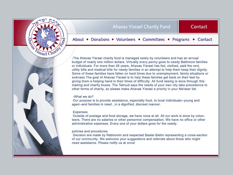
1- Do you need contact to be there twice? (the red box and the navigation bar) Maybe it would look cool if the red contact button had a rollover effect or something.
2- you probobly know this, but the paragraph and heading need to be organized. you, know, so you can tell where the heading is introducing the next concept.. and consistency with that.
uhh. That's all. :-)
I guess I should explain my designs better when I post them. The contact in the red bar is to indicate what the current page is, so for example if you are on the about page it will say "about" etc...
The paragraph was just put in to show where the page content goes I did not actually spend any time to formating it.
I would do your homework for you, but I am already busy doing Shira's :)
This comment has been removed by a blog administrator.
help.needs.color.baaad.ly!
The color palette now is too..blah. Too sterile. The red is a great kicker with the grey, but you need anotehr color element added to it for dimension.
I see what sara mirel says above: by putting 'contact' in a RED box in the upper right, it looks more like it's a link to go to for contact info rathe r than to highlight what page you're on. It's too bright. Possibly just have whatever page you're currently viewing be in a diff. color [red] than the rest [which are currently blue].
p.s. had I known he could be contacted to do homework..wow..nice lil' business going on there!;)
p.p.s. glad to see he has more than one audience member commenting..
um er... I just used the colors from the existing logo, I did not want to make it too flashy. I seem to have a fear of color. Anyway, dont care too much because my design got messed up by the guy coding it, plus this whole thing was a "chessed job" and they were happy with it.
P.S. you got some help with your homework too ;)
P.P.S. A special thanks to my biggest fan!!
Post a Comment
<< Home